Just in case you were wondering, the saying “If it ain’t broke, don’t fix it” shouldn’t be applied to your website design.
Here’s why: your website essentially begins to break the moment you launch it. It’s like driving a new car off the lot – the second you hit the highway, the car loses 20% of its value.
This isn’t a pessimistic take or anything like that, it’s simply the state of doing business in our increasingly digital world. Tactics, design trends and most significantly, user experience requirements dictate it’s best practice to iterate your website and its design as frequently as you can.
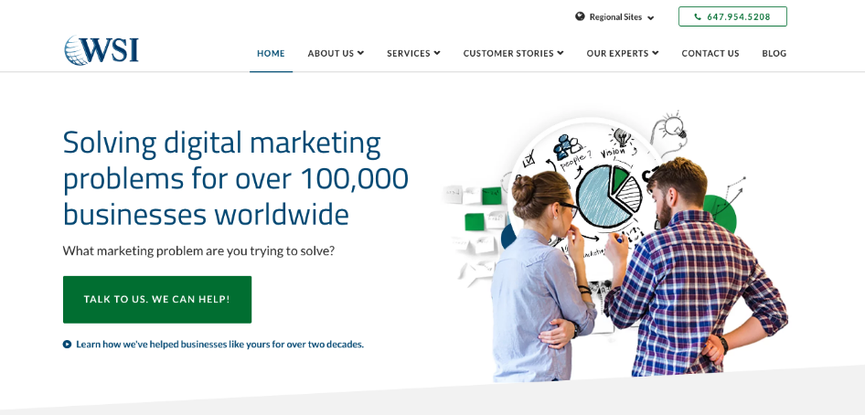
We recently redesigned and migrated our WSIWorld website; with that decision in mind, here are the reasons why it’s important to iterate your website’s design and UX on a regular basis:
The Digital World Moves Fast
Perhaps the biggest reason not to let your website’s design and UX stagnate is the speed at which the digital landscape moves. We do business in a world that changes fast – faster than most of us can even keep up with – and with that comes the need to quickly adapt the tactics, strategies and tools that we use. What worked in the digital world two years ago probably doesn’t work the same way today. So as good as your website looked and functioned two years ago, for all intents and purposes, in today’s digital world, it’s old.
Practice What You Preach
For us, redesigning our website and its UX was part of a company-wide dedication to “practice what we preach” or “drink our own champagne.” We say that we help businesses do better marketing, and in order to do that, we need to have our own ducks in a row. As we’ve discussed, in 2019 and beyond, it’s important to iterate your website’s design and UX on a regular basis. So that’s what we’ve done: we’ve completely revamped our website and UX. We’re really proud of the new site so please, have a look around and let us know what you think!
Follow The Numbers
In the digital marketing world, numbers and data are hugely important. As soon as you any website, you also begin collecting data on it. And unless you’ve somehow built the perfect website, that data is immediately going to tell you that certain components of your site are not working optimally. Whether that’s because users are behaving differently than you thought or a design element isn’t as engaging as you hoped doesn’t really matter. Once your site has been live for a few months, dig into the data and you’ll easily have a list of things to work on for the site’s next iteration.
Optimization, Optimization, Optimization!
Sometimes, you just can’t see all the angles until a project is launched. This is part of the reason why we’d rather ship something imperfect and iterate rather than waiting for perfection, but that’s a post for another day.

Throughout the process of creating the new WSIWorld, we: a) analyzed data on our legacy website b) considered modern design and UX trends c) audited our content and SEO strategy and d) really honed in on our customer personas. As a result, here are some rules of thumb we came up with, which you can use if you’re thinking about a website redesign of your own:
Don’t Make Your Visitors Think
If you give your website visitors too many things to think about or too many places to look or click, it causes cognitive friction. When users are overwhelmed by a page on a website, what do they most often do? Click back and try something else – otherwise known as a bounce.
This is why, on the homepage of your website – above the fold – you should try to tell your website visitors a) who you are b) what you do and c) why they should trust you. While it might seem difficult to do all of this in such a small space, it’s totally worth it to put the time and effort into optimizing this information.
Avoid “Greedy Marketer Syndrome”
Picture this: you’ve got a new website and you’re excited. You want to reap the benefits of all that hard work as soon as possible. You launch the site and can’t wait to get that first conversion. Sound familiar?
As tough as it is, we recommend avoiding “greedy marketer syndrome.” The fact is, we shouldn’t really want or expect our website visitors to take the bottom-of-the-funnel conversion action right away. We should earn their trust and allow them to make their own decision without being overly pushy.
This is why, for example, we chose to go with “Talk To Us. We Can Help.” as our main CTA button text instead of something like “Book A Consultation Now!”
Conduct Website Design Post-Launch Analysis
We’ll close this post out by saying, don’t forget to conduct a post-launch analysis once you’ve rolled out the new site and UX. There will be immediate data so why not use it? Heatmaps and A/B tests can give you insight as to how users are engaging and what they’re clicking on – maybe you can even make some tweaks with this data right away.
Good luck, and be sure to reach out of you have any feedback on the brand new WSIWorld!
WSI was founded in 1995 and is an innovative digital marketing agency with offices in over 80 countries. We’ve spent over 20 years helping more than 100,000 companies and large global brands unlock the full potential of their business by leveraging the Internet and its many unrecognized opportunities. We’d be happy to help do the same for you and consult on your digital marketing strategy. Simply give me a call or email me at rknutsen@wsiebizsolutions.net to learn more.


